Property-Sheet Style Dialog
Description
To create a property-sheet style Xdialog.
Create a new Action Script.
Select "Xdialog Windows" in the Category list.
Select "Display an XDialog Box" in the Action list.
Click OK to display the Script Genie.
Enter the name of new variable in the Variable Name field.
Optionally, change the value of the Prompt field.
Optionally, change the selection in the data Type list.
Set the Width and Height of the resulting dialog box.
Select "Property-sheet style Dialog" in the Style list.
Click Define Property-Sheet Dialog to display the Property Sheet Builder.
Property Sheet Builder
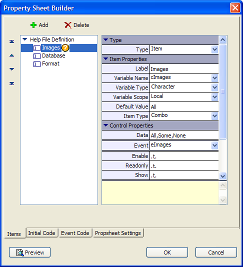
The Items tab of the Property Sheet Builder allows you to specify a hierarchy of menu entries.
Category entries - are menu groupings. Categories can be collapsed and expanded.
Item entries - are menu selections. Items set the value of variables and generate events.
Separator - a horizontal line that visually groups entries.
Text - static text
For each entry click Add to display the Add Entry dialog.
Select one of the following Type radio buttons:
New Category
Item
Separator
Text
Enter the text for the entry in the Settings > Name field.
Item
If you selected "Item" in step 1a, enter values into the following fields.
Enter the name of the variable that will be set in the Variable name field.
Select the Variable scope. The options are:
"Local"
"Session"
"Global"
Select the Variable type. The options are:
"Character"
"Numeric"
"Logical"
Optionally, set a Default Value for the variable. Character strings should not be quoted.
Select the Control type. The options are:
"Edit" - allows you to enter a character, date, or numeric value
"Smart" - opens a dialog that helps you select or enter a value
"Combo" - presents a list, but does not allow new entries
"EditCombo" - presents a list, but allows new entries
Input the Event name of the variable.
Click OK to return to the Property Sheet Builder.
Optionally, enter values the Control Properties > Data field.
1. For Combo controls enter a comma separated list or an "@" followed by the name of variable containing a CR-LF delimited list. You must DIM this variable and populate this list on the Initial Code tab. See Defining the Contents of a Combo Box.
2. For Smart Button controls, enter the code to execute in the format: field_name = function(). See Creating Smart Fields.
3. For Check box controls, enter the check box text. Character values should not be quoted.
Set the value of Control Properties > Enable. The options are:
.T. = always enable the item
.F. = always disable the item
A logical variable or expression that can be changed from TRUE to FALSE to selectively enable or disable the item.
Set the value of Control Properties > Readonly. The options are:
.T. = always allow the user to read but not change the value
.F. = always allow the user to read or change the value
A logical variable or expression that can be changed from TRUE to FALSE to selectively change the item from read-only to editable.
Set the value of Control Properties > Show. The options are:
.T. = display the item
.F. = hide the item
A logical variable or expression that can be changed from TRUE to FALSE to selectively display or hide the item.
New Category
If you selected "New Category" in step 1a:
Make a selection from the Category Properties > Initial state list. The options are:
"Opened"
"Closed"
Set the value of Category Properties > Show Category. The options are:
.T. = always display the category
.F. = always hide the category
A logical variable or expression that can be changed from TRUE to FALSE to selectively display or hide the category.
Set the value of Category Properties > Show Label. The options are:
.T. = always display the label
.F. = always hide the label
A logical variable or expression that can be changed from TRUE to FALSE to selectively display or hide the label.
Text
If you selected "Text" in step 1a:
Enter the text to display in the Text Properties > Text field.
Enter the number of rows it is to span in the Text Properties > Row Span field.
Other Tabs
Use the Initial Code tab to other DIM variables, such as those containing lists, and set their initial values.
Use the Event Code tab to write code that responds to item events and runs scripts, functions, etc.
Display the Propsheet Settings tab.
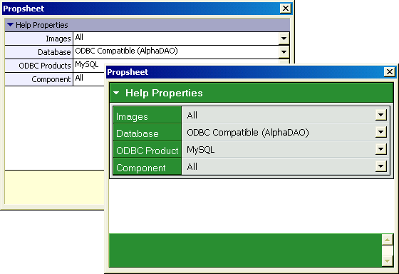
Select the Type of property sheet. The two styles are "Normal" and "WebForm Style" and illustrated below.
If you selected "Normal" in step 4, select the Icon Style and Icon Color.
If you selected "WebForm Style":
Select the cascading style sheet to use from the WebForm Style list. See also Webform Style Builder.
Select the font size from the Font Scale list. The options are:
"Smallest"
"Smaller"
"Medium"
"Larger"
"Largest"
Optionally, modify the Row Height, Header Width, and Help Height.
Click OK to exit the Property Sheet Builder.
Continue with Define Title of Display an Xdialog Box.
Defining the Contents of a Combo Box
There are two ways to populate a combo box.
Enter the values into the Control Properties > Data field in the format: Value1,Value2,Value3...ValueN.
Define the list with Xbasic code:
1. Place a reference to the list in the Control Properties > Data field in the format: @ListVariableName.
2. Display the Initial Code tab.
3. Set the values of the list in the following format:
ListVariableName = <<%str%
Value1
Value2
Value3
...
ValueN
%str%
Creating Smart Fields
Smart fields are highly desirable when you want to enter the following types of data.
Color
myColor = UI_SELECT_COLOR2()
Date
myDate = UI_GET_DATE_CALENDAR()
Field Name
myField = UI_GET_FIELDNAME()
Filter Expression
myFilter = UI_GET_FILTER()
Font
myFont = UI_GET_FONT()
Order Expression
myOrder = UI_GET_ORDER()
Others
To return multiple selections, try something like this. This function call uses UI_GET_LIST2() to return one or more values from a list created by TABLE.EXTERNAL_FIELD_NAME_GET().
myFields = ui_get_list2("Select Fields", "", table.external_field_name_get(tbl_name, "N"), 2)Hiding and Displaying an Item or Category
Create a logical variable with an initial value that corresponds to whether the item or category should be initially hidden or displayed.
dim showVariableName as L = .F.
Place the name of this variable into the Control Properties > Show field.
Display the Event Code tab of the Property Sheet Builder.
Select the Change event of the item that will trigger the change from hidden or shown.
Enter code that resets the value of showVariableName. See the following pictures for an example.
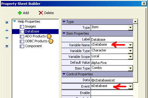
The Item Properties > Variable Name field of the "Database" item contains the variable cDatabase. The user selection in the combo box sets this variable's value.
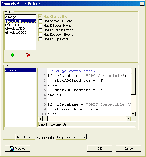
The event variable eDatabase has code attached to its Change event. The code tests for the value of the cDatabase variable, and sets the value of showADOProducts.
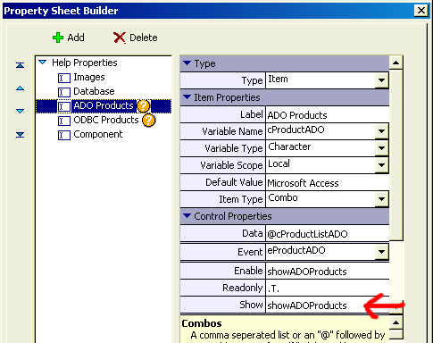
The Control Properties > Show field of the "ADO Products" item contains the showADOProducts variable. When the value is TRUE (.T.), the item is visible. When the value is FALSE (.F.), the item is hidden.
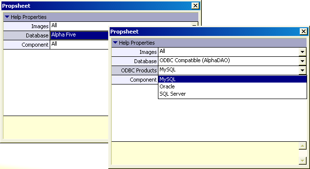
This picture shows the property sheet dialog with the "ODBC Products" item that appears only when "ODBC Compatible (AlphaDAO)" is selected from the "Database" list.
Responding to Events
Each category and item generates the following events:
Change
SetFocus
KillFocus
Keypress
Keydown
Keyup
You can attach Xbasic code to any of these events.
See Also
